
The Good
 The new "Quick Links" bar.
This has a good list of places that I visit most often. This should probably be contextual based on the page you're currently on, so the "Faculty" page would have different quick links than the "Students" page, but again they should be testing this on actual users.
 Contact information on most pages.
Most pages have phone numbers and addresses listed in a prominent location. This is an excellent step and something I've called for.
The footer.

On a site like CMC's where users have a diverse set of goals, you want to get people to where they are trying to go as quickly as possible. The footer makes this possible with a ton of deep links to pages you probably want to visit.
Much more readable faculty profile pages, as well as an acknowledgement that social media and student websites exist.
The Bad
Horribly small default font size.
The default font size is 11px, which is fine for people under 40, but really difficult to read for people over 40, especially because users don't know how to change the font size in their browser. In addition, a small font size makes a link more difficult to click on because the target is so small - see Fitts Law. The small font size makes it hard to distinguish text in low contrast environments as well.

Not changing the color of visited links.

On a Google search results page, I can see at one glance which links I've already visited, because they are purple. No such luck on CMC's site, which displays every link in blue. This violates rule #3 of Jakob Nielsen's Top 10 Mistakes of Web Design, and has been shown in tests to disorient users, and cause them to visit the same page over and over.
The menu bar text shows up inconsistently.

The menu bar is the series of grayish-red boxes, which as you can see contain no text. This photo was using the latest version of Chrome on a Mac. Props to CMC for trying to use Cufon but they need to work out the bugs and test in all browsers.
No mobile version of the site.
Mobile devices should load an alternate stylesheet that presents the main content without the fluff, to save bandwidth and optimize the information presentation for a smaller screen.
Clicking on the logo doesn't take you back to the frontpage.
When you click on the logo in the corner of every page you are taken to cmc.edu/discovercmc, instead of the homepage. This violates a well known usability convention: if the logo is clickable, it should take you to the homepage. I challenge you to find a top 500 website where this is not true.
No Analytics.
This means that Public Affairs isn't collecting data about which pages are popular, which keywords users are searching for to find our site, and which links are being clicked on, which implies they don't really care about how users use the site, and will hurt their ability to iteratively improve the site navigation in the future.
No caching site resources or minifying Javascript.
Page load times are slow; CMC scores only 63/100 in Google's Online Page Speed tool. Because no images, scripts or stylesheets are cached, they have to be reloaded every time the user reloads a page. This is costly in terms of speed and bandwidth. Fortunately this is easily fixable in Apache.
The Ugly
The homepage. Holy cow, this is a mess. Some of the problems:
- No search bar. This is stupid - the search bar exists in the page's source but is hidden from the user.
- Fourteen links to other pages. On a page whose goal should be to get users deep within the site as quickly as possible, having this few links is unacceptable.
- Incredibly small link targets make the links hard to click.
- No skip links for disabled users.
- Changing the center image will require extensive Photoshopping to remove the background, which in the end will reduce the total number of changes made to the frontpage slideshow.
- The "Discover CMC" link looks like an ad, and I missed it the first six times I visited the homepage
- There's no way to determine at a glance what separates CMC from every other university. One of the boxes has some bland text below a "Why CMC" header but the page has to do better.
- It's not clear where you should click to find any of the items described here:
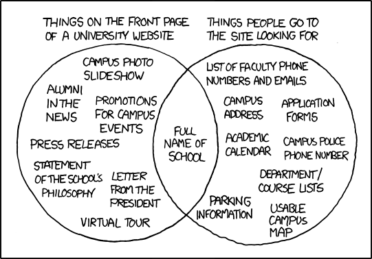
- No meta
description or keywords, which are essential for search engine optimization (SEO).

Big Ass Images that Convey No Information
Here's the homepage for current students:

And here are the parts of that page that are actually clickable:

The prime real estate on the page is taken by an unclickable infographic telling us that upperclassmen return to campus on August 28. Here's the same information, in a more compressed format:
8/28 Students ReturnThe image on the page is 465 pixels wide by 290 high, or 134850 pixels of screen real estate. My compressed version is roughly 150 pixels wide by 18 high, for 2700 pixels of screen space, a 4900% improvement in information density.
More generally, big ass images take forever to load (especially important on mobile devices) and don't contribute anything to the page. User test after user test shows users ignore filler images, and that visual bloat is annoying.
The SEO strategy/URL's are still awful.
To illustrate CMC's nonexistent approach to search engine optimization (SEO), I'll use the faculty page for my thesis reader.

The page looks OK - the email link is a little wonky but it's fine. Now, what are the keywords we'd like to use to describe this page? The biggest one is the name of the professor - Ananda Ganguly. The second biggest is his department, Accounting, and then maybe we want to also have CMC as a keyword.
URL Contains No Keywords
Let's look at the page URL, which Google uses as part of its PageRank formula to determine what's actually on the page:
http://www.claremontmckenna.edu/academic/faculty/profile.php?Fac=519
This URL does not contain any of our relevant keywords, making the page tougher to find in a Google Search.
Nondescript Page Title
Let's look at the page title, which shows up in the browser bar, and is the bright blue link text when the page shows up in Google results, as well as a large component in the PageRank formula:

The page title is "Academics," which tells you zero about the page content. Since this page title is so non-descriptive, Google had to use its own algorithm to give the page a descriptive title in search results:

Generic Meta Tags
Let's look at the page meta description, which shows up as the black text below the blue text in a search result in Google:

The meta description is "Academics and research at Claremont McKenna College," which is generic enough that Google has to try to find better text on the page to use. The result isn't optimal:

No H1 Heading
Pages should have exactly one h1 heading containing information about the primary subject of the page text on the page. There's a perfect candidate - the professor's name, Ananda Ganguly. This text does not have an h1 heading - in fact, there's not a single h1 heading on the page.
No Alt Text for Images
There's a nice image of Professor Ganguly on the page. Images can't be crawled, it's important to provide an alt tag so Google knows what's in the image, as well as for blind users or users on slow internet connections. However, the image does not have an alt tag, so Google doesn't know the subject of the image.
Those are some really, really basic SEO optimizations. Figuring that stuff out would make CMC pages more prominent when researchers from other schools search for work done by CMC professors. I haven't done a thorough examination but I'm not confident that the rest of the site does much better.
Conclusion
I have the following questions for the CMC Public Affairs Office:- When deciding what to emphasize in the site redesign, did you interview a single user of the site? Did you ask any students, prospective students, faculty members, staff members, alumni members, or parents, about how they use the CMC website?
- How does the redesigned site address the complaints raised by users in question (1)?
- Could you explain how the new frontpage does a better job of conveying CMC's brand than the old frontpage? When you showed the frontpage to prospective students for 30 seconds and asked them to say what set CMC apart, what did they tell you?
- What metrics are you using to determine the success of the site redesign?
- What was the decision making process during the design of the site? Was evidence from user testing ever presented to inform design decisions?
Liked what you read? I am available for hire.
This was a fascinating post. Totally new stuff for me.
Wow. This was incredibly well thought out and researched. Thank you for such an in-depth, honest appraisal of the website. I hope the webmaster thinks carefully about each of the points you’ve raised.
Well done. This should be published on cmcforum.com. My article got a lot of attention from the administration when it was published a couple years ago… this stuff is what they need to hear.
Thanks Josh, I think it’s going up on their site soon.
Really comprehensive review. This site is rife with usability problems and I think you are right that there was probably NO user research before designing the site and I’d imagine there was little to no testing after.
I’m trying to load their site on an insanely fast connection (I share an office with a major hosting & network infrastructure company.) and it still crawls. Never seen cufon have bugs that severe and load time so long.
One more thing- there is no way this site meets any of the requirements for Section 508 website accessibility. No alt tags is probably one of the most important requirements and just the tip of that iceberg.
Anyone know what firm designed this site? Or was it all done internally?
Hey Julie, I don’t know who did the redesign; I haven’t been in touch with Public Affairs.
Hi Kevin,
The story on the forum today shows it was done internally by a single designer who is likely full-time staff: http://cmc.edu/directory/pr.php
I dug up his portfolio via LinkedIn:
http://anthonyfisher.com/brand-visual-design
Anyways, a site of this scale and size should not be designed by one designer, or an internal employee who won’t be able to challenge stakeholders. Design is meant to be done in teams and the best work is done by an outsider who can do unbiased interviewing and research.
His comment about being different for the sake of being different really bugged me out, since that is strongly in opposition to the entire UX field and its current thought leadership and writing.
I also highly doubt high school students are motivated to apply to CMC because the website is “different” from the others. (Perhaps if they interviewed some prospective students for user research we could answer this one more definitively.)
Good thoughts, Kevin.